
Simplifying life with faster bill payments
Simplifying life with faster bill payments
My role
My role
End-to-End design
Competitors research
Framework building
End-to-End design
Competitors research
Framework building
Team
Team
Tushar Prakash (PD)
Shreyas Chaudhary (SPD)
Manavi Singh (APM)
Kushal Jain (SPM)
Tushar Prakash (PD)
Shreyas Chaudhary (SPD)
Manavi Singh (APM)
Kushal Jain (SPM)
Timeline
Timeline
Design: Mar-May ‘24
Development: Jul-Oct ‘24
Launch: Nov ‘24
Aug - Dec ‘24
(Design & Development)
Launch: Nov ‘24
Design: Mar-May ‘24
Development: Jul-Oct ‘24
Launch: Nov ‘24
Niyo is a travel banking ecosystem centered around zero-forex cards. As we scaled, user behaviour highlighted a critical need for a deeply trusted payment infrastructure.
To solve this, we built Niyo Pay and in-house UPI saw rapid adoption, quickly becoming the primary checkout tool for flights, visas, and insurance transactions under ₹1 Lakh. This traction became the perfect catalyst for our next wave of payment innovation.
Niyo is a travel banking ecosystem centered around zero-forex cards. As we scaled, user behaviour highlighted a critical need for a deeply trusted payment infrastructure.
To solve this, we built Niyo Pay and in-house UPI saw rapid adoption, quickly becoming the primary checkout tool for flights, visas, and insurance transactions under ₹1 Lakh. This traction became the perfect catalyst for our next wave of payment innovation.
Goals for building it
Goals for building it
Increase transaction volume & payable amounts.
Increase transaction volume & payable amounts.
Build payment products for reliable eco-system.
Build payment products for reliable eco-system.
Diversify revenue streams beyond cards and travel offerings.
Diversify revenue streams beyond cards and travel offerings.
How do our customers feel about this?
How do our customers feel about this?
At Niyo, our vibrant community of travellers and students studying abroad plays a key role in our research and pilot product testing. Insights from the interaction:
As we offer co-branded debit and credit cards (in partnership with DCB & SBM Bank), users frequently need to pay their dues, alongside the idea of managing other essential bills intrigued them.
As we offer co-branded debit and credit cards (in partnership with DCB & SBM Bank), users frequently need to pay their dues, alongside the idea of managing other essential bills intrigued them.
On average, a user pays around 5-7 bills and manages a total of ~8 bills. They typically use 2 UPI apps, switching between them based on the convenience.
On average, a user pays around 5-7 bills and manages a total of ~8 bills. They typically use 2 UPI apps, switching between them based on the convenience.
Users often prefer a app for their bills primarily due to convenience, trust, and ecosystem benefits & we wanted to design for such experience.
Users often prefer a app for their bills primarily due to convenience, trust, and ecosystem benefits & we wanted to design for such experience.
From chaos to concepts
From chaos to concepts
How did we start?
How did we start?
Evaluated existing bill payment experiences from the products in the market.
Evaluated existing bill payment experiences from the products in the market.
What could we do differently?
What could we do differently?
The existing market experiences were largely identical. To stand out, we explored these key differentiators:
The existing market experiences were largely identical. To stand out, we explored these key differentiators:
Grouping of the due bills to pay all in one go
Grouping of the due bills to pay all in one go
Category based rewards system for user groups and activation banners for it
Category based rewards system for user groups and activation banners for it
Enabling auto-pay system for monthly recurring bills
Enabling auto-pay system for monthly recurring bills
I started creating iterations of the key screens and collaborated with Shreyas (SPD) to finalise few of the them which can be tested with the users.
I started creating iterations of the key screens and collaborated with Shreyas (SPD) to finalise few of the them which can be tested with the users.
Our goal was clear: Intuitiveness with better comprehension & simpler designs.
Our goal was clear: Intuitiveness with better comprehension & simpler designs.
Iterations of Biller/Service provider selection
Iterations of Biller/Service provider selection

Iterations of saved bills
Iterations of saved bills

We evaluated these cards on the basis of our Niyo’s design language, compactness, recall mechanism, and versatile form factor to cater different scenarios of a bill.
We evaluated these cards on the basis of our Niyo’s design language, compactness, recall mechanism, and versatile form factor to cater different scenarios of a bill.

Iterations of the Payment summary
Iterations of the Payment summary

Bill payments
Bill payments
final screens
final screens


Self-scalable system
Self-scalable system
We continuously worked with the product team to identify cases and defining fallback scenario. Since such issues can arise at any time, the system must be capable of autonomous scaling.
We continuously worked with the product team to identify cases and defining fallback scenario. Since such issues can arise at any time, the system must be capable of autonomous scaling.

Experience of paying bills
Experience of paying bills
Insights from testing concept
Insights from testing concept
I began showing it to the design team once I had a few iterations of the key screens to get early feedbacks. The feedback revealed several glows and grows of the concepts:
I began showing it to the design team once I had a few iterations of the key screens to get early feedbacks. The feedback revealed several glows and grows of the concepts:
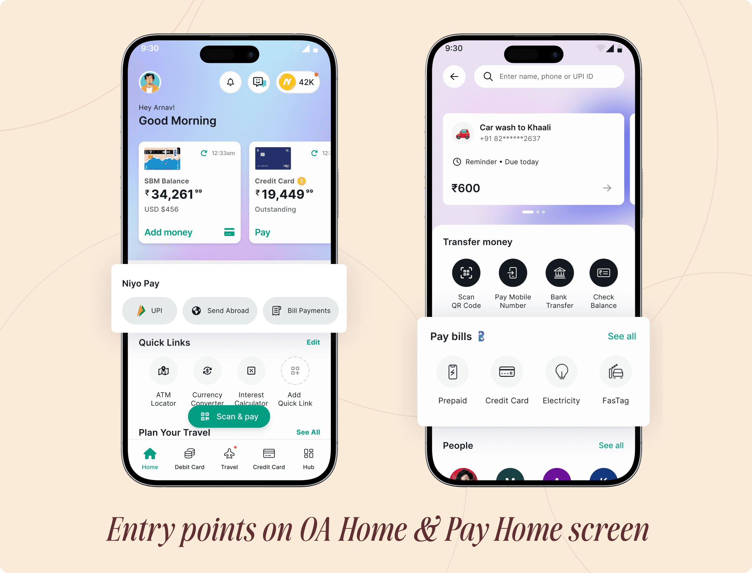
Discovery of entry point
Entry points in the One-app & Pay section was quite clear for them to get started.
Ease of usability
Users were able to navigate through the flow and understand the goal of each screen.
Delightful & user friendly
Screen construct worked well, and the payment summary screen came as a surprise.
Better comprehension
Few copies seemed bit off and unclear to them in the iteration. They did not resonate with the required action on the screen.
Few copies seemed bit off and unclear to them in the iteration. They did not resonate with the required action on the screen.
Optimisation for FTUX & rewards
Motivation to pay bills was missing as UI lacked rewards element. Rewards context was not consistently carried forward.
Conclusion
Conclusion
These insights gave us a clear strategic direction:
These insights gave us a clear strategic direction:
Optimise the first time user experience: Critical for ensuring new features aren't overshadowed within our multi-product ecosystem.
Optimise the first time user experience: Critical for ensuring new features aren't overshadowed within our multi-product ecosystem.
Contextual Rewards: Rather than expecting organic bill payments, we needed to incentivise users via contextual reward touch points.
Contextual Rewards: Rather than expecting organic bill payments, we needed to incentivise users via contextual reward touch points.
But everything didn’t went well for the release
But everything didn’t went well for the release
This was the moment just a month (start of October) before the MVP release, We hadn't heard from the business team about the rewards mechanism, as the discussion was still in progress. The product team was constantly chasing them for updates, as this might affect our feature adoption plans.
This was the moment just a month (start of October) before the MVP release, We hadn't heard from the business team about the rewards mechanism, as the discussion was still in progress. The product team was constantly chasing them for updates, as this might affect our feature adoption plans.
And things didn’t go as planned! We couldn’t offer rewards to the users for the MVP.
And things didn’t go as planned! We couldn’t offer rewards to the users for the MVP.
Release outcome
Release outcome
We launched Bill payments in November for Niyo users without rewards being offered to the users.
We launched Bill payments in November for Niyo users without rewards being offered to the users.
30k
Number of bills paid across categories in 1.5 yrs
7%
UPI transactions volume month on month
35%
Churn rate after 1st Bill payment
64%
Conversion rate from Bill generation to Bill paid
Learning & Reflections
Learning & Reflections
Bill payments was my first project at Niyo, I quickly realised I needed to understand the product, the business, and our audience to get started.
Bill payments was my first project at Niyo, I quickly realised I needed to understand the product, the business, and our audience to get started.
Early-stage testing of isolated screens proved ineffective; fragmented views often led to confusion. I learned that users alignment relies on the total experience and transitioning to a high-fidelity, end-to-end prototype worked well for us.
Early-stage testing of isolated screens proved ineffective; fragmented views often led to confusion. I learned that users alignment relies on the total experience and transitioning to a high-fidelity, end-to-end prototype worked well for us.
We also encountered an unforeseen issue during the feature launch when BBPS (Bharat Bill Payment System) introduced their new branding in August during Global Fintech fest’24 and rebranded as Bharat Connect for its bill payment system. It was intended to be adopted by every bill payment app starting in October.
The construct of the screen, combined with scalable components and a thoroughly thought-out approach helped us adopt this change gracefully.
We also encountered an unforeseen issue during the feature launch when BBPS (Bharat Bill Payment System) introduced their new branding in August during Global Fintech fest’24 and rebranded as Bharat Connect for its bill payment system. It was intended to be adopted by every bill payment app starting in October.
The construct of the screen, combined with scalable components and a thoroughly thought-out approach helped us adopt this change gracefully.
Thanks for scrolling to the end.
Thanks for scrolling to the end.
© 2026 Tushar Prakash