Tushar Prakash

Turning payments into a breeze with quick checkout
Turning payments into a breeze with quick checkout
Turning payments into a breeze with quick checkout
We envisioned payments as an integral part of the user journey for every product, with checkout being the final touchpoint before users complete their purchase. We felt it was the right time to rebuild our broken checkout experience.
We envisioned payments as an integral part of the user journey for every product, with checkout being the final touchpoint before users complete their purchase. We felt it was the right time to rebuild our broken checkout experience.
My role
My role
Experience design
Competitors research
Experience design
Competitors research
Team
Team
Tushar Prakash (PD)
Shreyas Chaudhary (SPD)
Kushal Jain (SPM)
Tushar Prakash (PD)
Shreyas Chaudhary (SPD)
Kushal Jain (SPM)
Timeline
Timeline
Aug ’24 - Dec ‘24
(Design & Development)
Aug ’24 - Dec ‘24
(Design & Development)
Aug - Dec ‘24
(Design & Development)
Know exactly what you're paying for
Know exactly what you're paying for

What are the current problems?
What are the current problems?
Up until Q1 2024, our payment gateway was powered by 'CC Avenue.' The old checkout flow had these problems:
Up until Q1 2024, our payment gateway was powered by 'CC Avenue.' The old checkout flow had these problems:
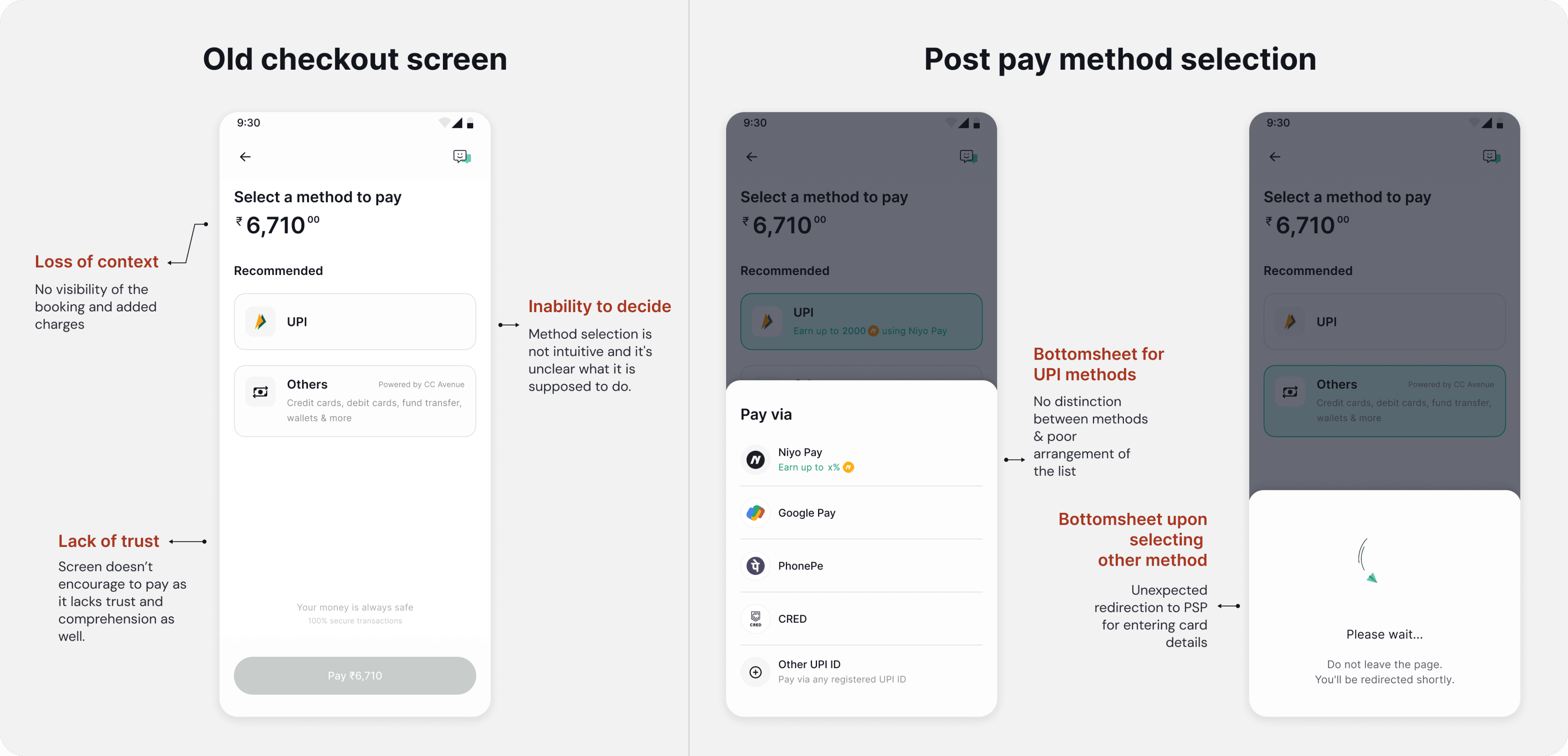
We realised that the problem isn’t just about a single screen—the entire experience feels broken and behaves agnostic.
We realised that the problem isn’t just about a single screen—the entire experience feels broken and behaves agnostic.
We started with defining our goal for shaping the ideal experience.
We started with defining our goal for shaping the ideal experience.
Goal was to build an intuitive checkout experience which encourages trust and reliability among the Niyo users.
Goal was to build an intuitive checkout experience which encourages trust and reliability among the Niyo users.
What does the user need?
What does the user need?
01
Visibility of the booking
Booking information for assurance before they pay
02
Freedom with instruments
Freedom of choosing the instrument they want to pay with
-Based on discussions with Niyo users from the community.
-Based on discussions with Niyo users from the community.
How did we start?
How did we start?
Checkout was not just an experience plugged into any service; it was meant to be the last pillar of the user's trust and convenience. So, we decided to start with:
Checkout was not just an experience plugged into any service; it was meant to be the last pillar of the user's trust and convenience. So, we decided to start with:
Market analysis
Analyse products to understand how do they manage the experience gracefully
Collaboration with teams
We synced up with Travel, Cards and Forex design & product members to figure out the information required to be shown on the checkout screen
Started with the iterations
Started with the iterations
Iterations of the checkout screen
Iterations of the checkout screen
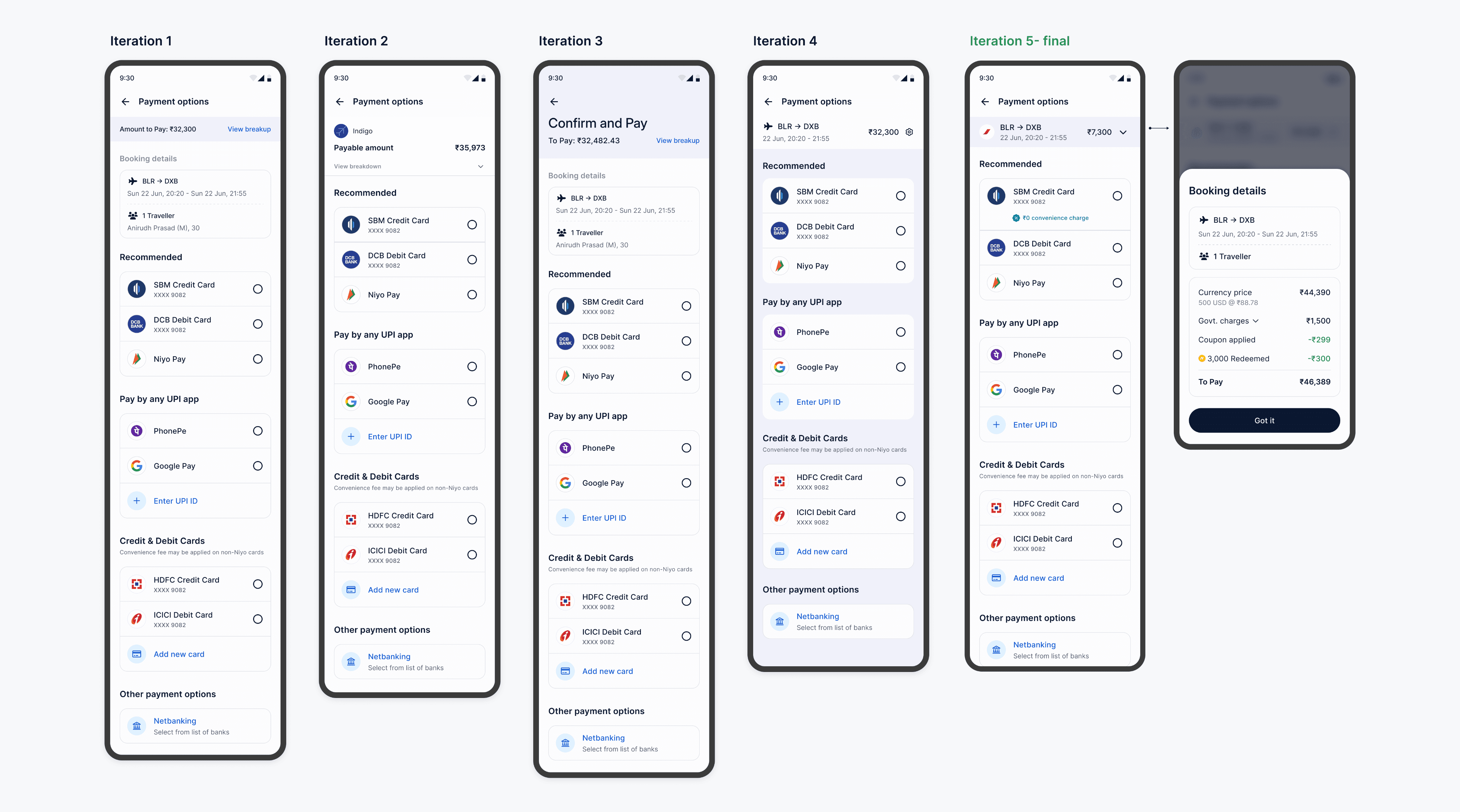
Our goal was to simplify the decision-making process at checkout to ensure high-intent users didn't stall.
In parallel, we wanted the Niyo co-brandedCredit Card as a high-visibility option, fulfilling business requirements to increase card penetration while maintaining a frictionless user journey.
Our goal was to simplify the decision-making process at checkout to ensure high-intent users didn't stall.
In parallel, we wanted the Niyo co-brandedCredit Card as a high-visibility option, fulfilling business requirements to increase card penetration while maintaining a frictionless user journey.

Design decisions
Design decisions
We decided to keep the booking information strip as minimal as possible and show rest of the details on-demand on the bottom sheet.
We decided to keep the booking information strip as minimal as possible and show rest of the details on-demand on the bottom sheet.
A “Recommended” section in the first fold and keep it configurable to show frequently used payment instruments to offer faster experience.
A “Recommended” section in the first fold and keep it configurable to show frequently used payment instruments to offer faster experience.
“Recommended” section can have 2 Niyo cards to drive business metrics & our in-house Niyo UPI which can be swapped with any recent/last used method later on.
“Recommended” section can have 2 Niyo cards to drive business metrics & our in-house Niyo UPI which can be swapped with any recent/last used method later on.
Leveraging rewards to drive our co-branded debit or credit card usage in the checkout.checkout.
Leveraging rewards to drive our co-branded debit or credit card usage in the checkout.checkout.
Construct of the screen:
Construct of the screen:
Paying for
Paying for
Paying for
How much to Pay
How much to Pay
How much to Pay
Paying with
Paying with
Paying with

Building systems to scale, not just designs
Building systems to scale, not just designs
Anatomy of the payment method selection
Anatomy of the payment method selection

Anatomy of the Order summary component
Anatomy of the Order summary component

Order summary component for all products
Order summary component for all products

Order summary component for bigger screen sizes (Web design)
Order summary component for bigger screen sizes (Web design)

How do we pay with different payment instruments?
How do we pay with different payment instruments?
Paying via new UPI ID
Paying via new UPI ID
Paying via saved or new CC/DC card
Paying via saved or new CC/DC card
Payment success rate increased by 22% just developing industry standard experience. And ~24% reduction in drop-off rates across all product funnels, specifically from the review screen to final checkout.
Payment success rate increased by 22% just developing industry standard experience. And ~24% reduction in drop-off rates across all product funnels, specifically from the review screen to final checkout.
We faced a major challenge while prioritising Niyo co-branded credit cards via the 'Recommended' section. Technical limitations in phase one prevented us from saving card details for Return users.
We faced a major challenge while prioritising Niyo co-branded credit cards via the 'Recommended' section. Technical limitations in phase one prevented us from saving card details for Return users.
We had a fair understanding that users would definitely drop off if we asked them to enter their card details every time they desired to transact with our card.
We had a fair understanding that users would definitely drop off if we asked them to enter their card details every time they desired to transact with our card.
To help users enter details, we explored these features for second phase release:
Card Scanning via OCR
Smart Copy-Paste
NFC (Near Field Communication)
Auto-fill via OTP
Solving for edge cases
Solving for edge cases
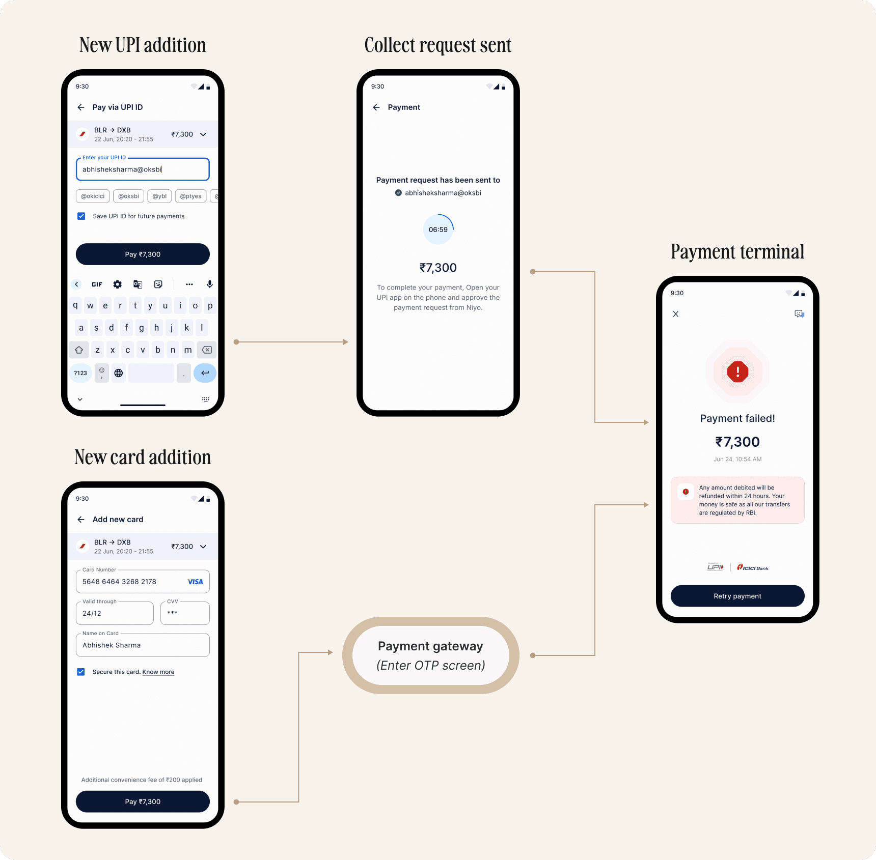
An experience that provides users with immediate context when a payment fails, offering clear explanations and actionable paths forward.
An experience that provides users with immediate context when a payment fails, offering clear explanations and actionable paths forward.
Behavioural cases
Behavioural cases
Case 1: Intent to change payment method or accidentally cancelled the request on target UPI app.
Case 1: Intent to change payment method or accidentally cancelled the request on target UPI app.
Case 2: Collect request expired on the UPI app or Entered invalid OTP/CVV/Validity for a new card.
Case 2: Collect request expired on the UPI app or Entered invalid OTP/CVV/Validity for a new card.
Conclusion: Transaction will be marked as failed and user has to initiate a new payment to complete their order.
Conclusion: Transaction will be marked as failed and user has to initiate a new payment to complete their order.
Constraint: For declined card payments, we lacked visibility into the exact reason for failure as we do not store sensitive info like CVV or OTP. we focused on using generic message to guide users toward a resolution.
Constraint: For declined card payments, we lacked visibility into the exact reason for failure as we do not store sensitive info like CVV or OTP. we focused on using generic message to guide users toward a resolution.
Technical and Soft interruptions
Technical and Soft interruptions
Case 1: Entered UPI ID is incorrect
Case 1: Entered UPI ID is incorrect
Case 2: Error prevention for payment methods
Case 2: Error prevention for payment methods

Case 3: Entered invalid card number
Case 4: Latency in order confirmation
Case 4: Latency in order confirmation
Payment terminal states
Payment terminal states
Release outcome
Release outcome
Avg. success rate across Flight, VISA, Insurance, eSIM, Hotels & Premium
56%
56%
Avg. success rate for UPI, Credit Card & Debit Card for products (combined)
81.25%
81.25%
Learning & Reflections
Learning & Reflections
While working on the checkout experience, I collaborated with each design pods and product team to gain clarity, ensure alignment to achieve quick wins.
Since this was going to be integrated into various products, and every transaction would go through it, we spent considerable amount of time edge cases, technical constraints and UX copies to ensure every pixel made sense. We also wanted to make sure that the solution follows a scalable, modular approach to support multiple products efficiently.
While working on the checkout experience, I collaborated with each design pods and product team to gain clarity, ensure alignment to achieve quick wins.
Since this was going to be integrated into various products, and every transaction would go through it, we spent considerable amount of time edge cases, technical constraints and UX copies to ensure every pixel made sense. We also wanted to make sure that the solution follows a scalable, modular approach to support multiple products efficiently.
Beyond the visual design, the core learning was mapping use cases and solving for possible drop-offs at different stages. Designing a critical money-at-stake flow requires awareness of technical limitations, providing escape doors for users and proactive scope adaptation.
Beyond the visual design, the core learning was mapping use cases and solving for possible drop-offs at different stages. Designing a critical money-at-stake flow requires awareness of technical limitations, providing escape doors for users and proactive scope adaptation.
What’s next in it?
What’s next in it?
While working on this, a few more future requirements came into focus, which were:
While working on this, a few more future requirements came into focus, which were:
Scope of coupons for price waive off or earn % Niyo coins upon purchasing
Responsive web designs of the checkout experience for our products
Thanks for scrolling to the end.
Thanks for scrolling to the end.
© 2026 Tushar Prakash